Aligning ggplot2 graphs on a page
May 22, 2014Let’s say you have two graphs, a box plot and a line graph, with the same x axis and would like to have them aligned in a single two panel plot. Since the y axes are unrelated, we want to keep them as separate panels and avoid a confusing secondary y axis but we want the line graph to be smaller and sit on top of the box plot.
Some libraries we’re going to need
library(ggplot2)
library(gtable)

## Loading required package: grid

library(grid)
First, generate some made up data for the box plot
mv <- sqrt(c(25, runif(7, 2.5, 3.5), runif(4, 0, 1)))
mn <- length(mv)
ms <- letters[1:mn]
df <- NULL
for (i in 1:20) {
    df <- rbind(df, data.frame(sample = ms, val = (mv + rnorm(mn, 0, 0.1 * mv))^2))
}
summary(df)

##      sample         val
##  a      : 20   Min.   : 0.12
##  b      : 20   1st Qu.: 0.78
##  c      : 20   Median : 2.63
##  d      : 20   Mean   : 4.08
##  e      : 20   3rd Qu.: 3.40
##  f      : 20   Max.   :34.63
##  (Other):120
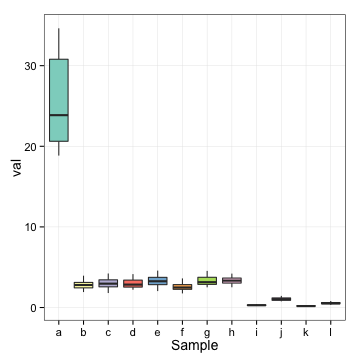
Here is what the box plot should look like
p.box <- ggplot(df) +
    geom_boxplot(aes(sample, val, fill = sample)) +
    scale_fill_brewer(palette = "Set3") +
    labs(x = "Sample", "Measure") +
    theme_bw(14) +
    theme(panel.grid.minor = element_blank(),
          panel.border = element_rect(color = "black"),
          legend.position = "none")
print(p.box)
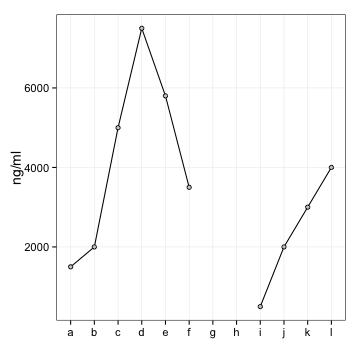
And now the line plot data
drug.level <- data.frame(sample = factor(ms), ng = c(15, 20, 50, 75, 58, 35,
    NA, NA, 5, 20, 30, 40) * 100)
And the plot itself
p.line <- ggplot(drug.level) +
    geom_line(aes(sample, ng, group = 1)) +
    geom_point(aes(sample, ng), pch = 21, fill = "grey80") +
    labs(x = "", y = "ng/ml") +
    theme_bw(14) +
    theme(panel.grid.minor = element_blank(),
          panel.border = element_rect(color = "black"),
          legend.position = "none")
print(p.line)

## Warning: Removed 2 rows containing missing values (geom_point).
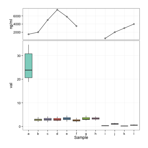
I purposefully set the scale so that the axis labels on the line plot are longer, which leads to unaligned plots when they are just stacked up. So we need to adjust the widths of the plots to be equal. In order for the plots to look nice, we also need to remove some margins and remove the axis labels on the line plot:
p.box <- p.box + theme(plot.margin = unit(c(-0.2, 1, 1, 1), "cm"))
p.line <- p.line + theme(axis.text.x = element_blank(),
                         axis.title.x = element_blank(),
                         axis.ticks.x = element_blank(),
                         plot.margin = unit(c(1, 1, -0.2, 1), "cm"))
We create grobs (grid objects) from the graphs
g.box <- ggplotGrob(p.box)
g.line <- ggplotGrob(p.line)

## Warning: Removed 2 rows containing missing values (geom_point).
Each of the grobs has a widhts vector that contains unit sized widths for the different parts of a plot. Parts 2-5 seem to be the ones we’re interested in. Find the maximum for each part across the plots and set the widths of all the plots to that maximum
maxwidths <- grid::unit.pmax(g.box$widths[2:5], g.line$widths[2:5])
g.box$widths[2:5] <- as.list(maxwidths)
g.line$widths[2:5] <- as.list(maxwidths)
And then create a gtable (higher level interface to the grid system) with 2 rows, one of which is less tall than the other
g <- gtable_matrix(name = "demo",
                   grobs = matrix(list(g.line, g.box), nrow = 2),
                   widths = unit(7, "in"),
                   heights = unit(c(2, 5), "in"))
And draw the gtable
grid.newpage()
grid.draw(g)